In January 2015, The third edition of “A guided Tour of Mathematical Methods for the Physical Sciences” will be available in stores! This book, written by Roel Snieder and Kasper van Wijk, aims to teach mathematical physics by doing lots of fun exercises on a variety of applications in (geo)physics. Roel and Kasper thank all our friends, family and colleagues who contributed in one form or another. Many of them are PALs.
Author: kvan637 (page 7 of 8)
To avoid grainy graphics and the wrong size/type of fonts in publications and presentations, inkscape has a wonderful option, created by Johan Engelen, that splits a figure into the drawing alone and a small latex file that calls the drawing and places all fonts. When you now embed the latex file in your presentation or your publication, the latex style file will determine the size and type of the font used. The result is a perfectly embedded figure in the style of your document! Below are the steps to Nerd Nirvana:
Draw your figure
Let’s draw a figure. Here is a figure in svg-format, made in inkscape:
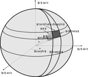
Note that we use latex math commands here, which makes this figure looks a bit messy, at first. When we are done drawing, we save as a pdf, and choose the option: “pdf+latex.” The font-free pdf file is spherefigc2.pdf, and the latex file that places the fonts in it, is
%% Creator: Inkscape inkscape 0.48.5, www.inkscape.org %% PDF/EPS/PS + LaTeX output extension by Johan Engelen, 2010 %% Accompanies image file 'spherefig2c.pdf' (pdf, eps, ps) %% %% To include the image in your LaTeX document, write %% input{<filename>.pdf_tex} %% instead of %% includegraphics{<filename>.pdf} %% To scale the image, write %% defsvgwidth{<desired width>} %% input{<filename>.pdf_tex} %% instead of %% includegraphics[width=<desired width>]{<filename>.pdf} %% %% Images with a different path to the parent latex file can %% be accessed with the `import' package (which may need to be %% installed) using %% usepackage{import} %% in the preamble, and then including the image with %% import{<path to file>}{<filename>.pdf_tex} %% Alternatively, one can specify %% graphicspath{{<path to file>/}} %% %% For more information, please see info/svg-inkscape on CTAN: %% http://tug.ctan.org/tex-archive/info/svg-inkscape %% begingroup% makeatletter% providecommandcolor[2][]{% errmessage{(Inkscape) Color is used for the text in Inkscape, but the package 'color.sty' is not loaded}% renewcommandcolor[2][]{}% }% providecommandtransparent[1]{% errmessage{(Inkscape) Transparency is used (non-zero) for the text in Inkscape, but the package 'transparent.sty' is not loaded}% renewcommandtransparent[1]{}% }% providecommandrotatebox[2]{#2}% ifxsvgwidthundefined% setlength{unitlength}{565.85061095bp}% ifxsvgscaleundefined% relax% else% setlength{unitlength}{unitlength * real{svgscale}}% fi% else% setlength{unitlength}{svgwidth}% fi% globalletsvgwidthundefined% globalletsvgscaleundefined% makeatother% begin{picture}(1,0.5817873)% put(0,0){includegraphics[width=unitlength]{spherefig2c.pdf}}% put(0.34077896,0.28258916){color[rgb]{0,0,0}makebox(0,0)[lb]{smash{$r$}}}% put(0.58016112,0.22314528){color[rgb]{0,0,0}makebox(0,0)[lb]{smash{$y$}}}% put(0.02588695,0.05284654){color[rgb]{0,0,0}makebox(0,0)[lb]{smash{$x$}}}% put(0.26925349,0.33843429){color[rgb]{0,0,0}makebox(0,0)[lb]{smash{$theta$}}}% put(0.20743185,0.09461795){color[rgb]{0,0,0}makebox(0,0)[lb]{smash{$varphi$}}}% put(0.51123087,0.43150768){color[rgb]{0,0,0}makebox(0,0)[lb]{smash{$ {bf hat{boldsymbolvarphi}}$}}}% put(0.45832621,0.49970874){color[rgb]{0,0,0}makebox(0,0)[lb]{smash{${bf hat{r}}$}}}% put(0.47736687,0.29366584){color[rgb]{0,0,0}makebox(0,0)[lb]{smash{$ {bf hat{boldsymboltheta}}$}}}% put(0.18005551,0.55995116){color[rgb]{0,0,0}makebox(0,0)[lb]{smash{$z$}}}% put(0.25781455,0.40019168){color[rgb]{0,0,0}makebox(0,0)[lb]{smash{$(x,y,z)$}}}% end{picture}% endgroup%
All that is left to do, is import this into your main latex file:
begin{figure} import{newfigs/}{spherefigc2.pdf_tex} caption{Definition of the geometric variables for an infinitesimal volume element $dV$ in spherical coordinates.} label{Sphere.figc} end{figure}
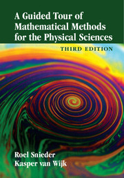
where the end result, looks like this:
this is a low-grade snapshot of a page of our book, but if you want to see the vectorised plot, click here.
Exporting the complete figure
Some editors of journals or books may not be set up to do this dynamic handling of fonts in figures. For them, you can “export” to a pdf file with the (correct) fonts statically embedded, you can use the package standalone.cls. Note that in the code below, we tell standalone to call the fonts from the class you want (in this case, cambridge6A.cls):
documentclass[class=cambridge6A,crop=true]{standalone} usepackage{import} usepackage{color} usepackage{graphicx} usepackage{amsmath,latexsym,amsfonts} begin{document} import{newfigs/}{spherefig2c.pdf_tex} end{document}
and its output you could call in your main latex file, in the “traditional” latex way:
begin{figure} includegraphics{spherefig2cwithfontsembbeded.pdf} caption{Definition of the geometric variables for an infinitesimal volume element $dV$ in spherical coordinates.} label{Sphere.figc} end{figure}
Last week, several PALs took advantage of a rain-less spring afternoon to visit the volcanic island Rangitoto off the coast of Auckland. The field trip consisted of appreciating the diverse geology and biology while tramping up the volcano, admiring the views of the Auckland skyline, and exploring the lava caves.
Left to right: visiting Student Miriam Timmerman from University of Twente, Sam Hitchman, Jami Johnson, and Jackson MacFarlane
As of this week, we have a sister station in Tohoku Japan: THJP. The first images coming out of this station show how seismically active that region is. Of course everyone remembers the Big Tohoku Earthquake. Our colleagues at Tohoku University have been playing an important role in understanding the underground structure, and tectonic processes that shape — and shake — Japan.

Click on this image to enlarge it. You will see the signals of several local events annotated by Dr. Kentaro Emoto using Japan’s seismic network Hi-net.
In GEOPHYS310, we learn python. One of the exercises is to plot a station (circle) on a map, with a circle representing some epicentral distance to an earthquake:
import cartopy.crs as ccrs import matplotlib.pyplot as plt proj = ccrs.PlateCarree(central_<wbr>longitude=180) ax1 = plt.subplot(111, projection=proj) ax1.set_extent([-50, 50, -40, 40], crs=proj) ax1.stock_img() ax1.tissot(rad_km=3200, lons=180, lats=10, alpha=0.3) ax1.plot(0,10,'rv') # note the longitude is now with respect to the central_longitude, but NOT for the tissot circle! plt.show()
In GEOPHYS330, we do a ray tracing exercise. Here is some code to perform the task of estimating the origin time and the epicentral distance of an earthquake:
from obspy import UTCDateTime import numpy as np import matplotlib.pyplot as plt from obspy import read from obspy.taup import TauPyModel def main(): # estimate the epicentral distance. This is one of your free parameters: Delta = 35 # in degrees # estimate the origin time of the earthquake; your other free parameter: t0=UTCDateTime("2014-04-13T12:25:19") maxamp = readandplotseismogram("https://pal.auckland.ac.nz/files/2014/08/quake.sac_.gz") computeandplottts(Delta,t0,maxamp) # tighten up the axes, and show: plt.axis('tight') plt.show() #return def readandplotseismogram(seismogram): '''read and plot the seismogram''' # read the stream st = read(seismogram) starttime = UTCDateTime("2014-04-13T12:38:00") st.trim(starttime,starttime+1000) # the trace in the stream is tr = st[0] # Make a time array and an amps array: t1= tr.stats.starttime.timestamp t2= tr.stats.endtime.timestamp npts = tr.stats.npts times = np.linspace(t1,t2,npts) amps = tr.data maxamp = max(amps) #Plot the seismogram against a grid plt.figure(figsize=(12,3)) plt.plot(times,amps,color='blue') #Converting tick marks to actual times: locs, labels = plt.xticks() new_label=[] for loc in locs: new_label.append(UTCDateTime(loc).strftime("%H-%M-%S")) plt.xticks(locs,new_label,rotation=10) plt.xlabel('Time (HH-MM-SS UTC)') plt.ylabel('Displacement') plt.grid() return maxamp def computeandplottts(Delta,t0,maxamp): # compute arrival times based on a epicentral distance (and depth, but # I fixed depth to a constant value): model = TauPyModel(model="iasp91") arrivals = model.get_travel_times(distance_in_degree=Delta,source_depth_in_km=10) #Construct vertical lines to show arrival times of predicted seismic waves for arrival in arrivals: dummy = t0+ arrival.time if arrival.name == "P": plt.vlines(dummy,-maxamp/2,maxamp/2) plt.text(dummy,maxamp/2+0.05*maxamp,arrival.name) if arrival.name == "PP": plt.vlines(dummy,-maxamp/2,maxamp/2) plt.text(dummy,maxamp/2+0.05*maxamp,arrival.name) if arrival.name == "S": plt.vlines(dummy,-maxamp/2,maxamp/2) plt.text(dummy,maxamp/2+0.05*maxamp,arrival.name) if arrival.name == "SS": plt.vlines(dummy,-maxamp/2,maxamp/2) plt.text(dummy,maxamp/2+0.05*maxamp,arrival.name) return() # this will actually run the code if called stand-alone: if __name__ == '__main__': main()
In one of our labs for GEOPHYS330, we use the ray tracing software TauP. Below is an example of how to use TauP from within python (using obspy), our computer language of choice for the lab, course, and department:
from obspy.taup.tau import plot_ray_paths plot_ray_paths(source_depth=100,phase_list=['P'],npoints=25)
In GEOPHYS330, we use python to download, plot and do a regression on a hundred years of sea level measurements in the Auckland harbour:
# these are the modules that contain functions we will use in the script: import csv # this is to read a "comma separate values" file from urllib.request import urlopen # to read csv data from a website import matplotlib.pyplot as plt # plotting functions import numpy as np # numerical tools from scipy.stats import linregress # linear regression function import pandas as pd # you can find and load the sea level data for Auckland here: url="http://www.psmsl.org/data/obtaining/rlr.monthly.data/150.rlrdata" df = pd.read_csv(url,delimiter=';') # "bad" values are defined by a large negative number, so we only # accept positive values: df = df[df.iloc[:,1] >= 0] # convert the pandas dataframe to numpy matrix: npdat =df.as_matrix() time= npdat[:,0] height = npdat[:,1] slope, intercept, r_value, p_value, std_err = linregress(time,height) print("r-squared: %f", r_value**2) # plot the sea height data: plt.plot(time,height,'ro') plt.plot(time,intercept+slope*time,'k') plt.grid() plt.xlabel('Date (year)') plt.ylabel('Sea height (mm)') plt.title('Sea height at Princes Wharf, Auckland (New Zealand)') plt.legend(['measurements','best linear fit'],loc=4) plt.axis('tight') #plt.savefig('sealevel_auckland.png') plt.show()
As of today, station AUCK is in the basement of the Science Centre, City Campus of the University of Auckland. With its design, the SeisNZ project will be able to reach out to students, visitors, or any other interested parties.This station is part of a growing network of educational seismometers around the country. From now on, you will be able to hunt for earthquake signals in AUCK data from the latest NZ earthquakes and beyond.
One of our PALs — Leighton Watson — is featured in the North Shore Times, showing this is not just some door-to-door rag, but a bastion of high-quality journalism, tailoring to the well-educated. When he wraps up his Honours project, he’ll be famous among rock physicists as well….. In any case, congrats to Leighton and we wish him all the best next year at Stanford!